I heard about a contractor last week who lost a £120,000 project because their website wouldn't load properly on a phone. The client was sat in a cafe with 20 minutes to kill before their next meeting, decided to do some quick research on the shortlisted firms, and this contractor's site just... spun. And spun. And eventually the client gave up and moved on to the next name on the list.
The contractor never even knew they'd lost the opportunity. They just didn't make the final cut. No explanation, no feedback, just a polite "we've decided to go with someone else" email weeks later.
Here's the uncomfortable truth: your website is being judged on phones, tablets, and dodgy mobile connections far more often than on office computers with fibre broadband. And if it doesn't work in those conditions which, let's be honest, most construction websites absolutely don't - you're invisible to a massive chunk of potential work.
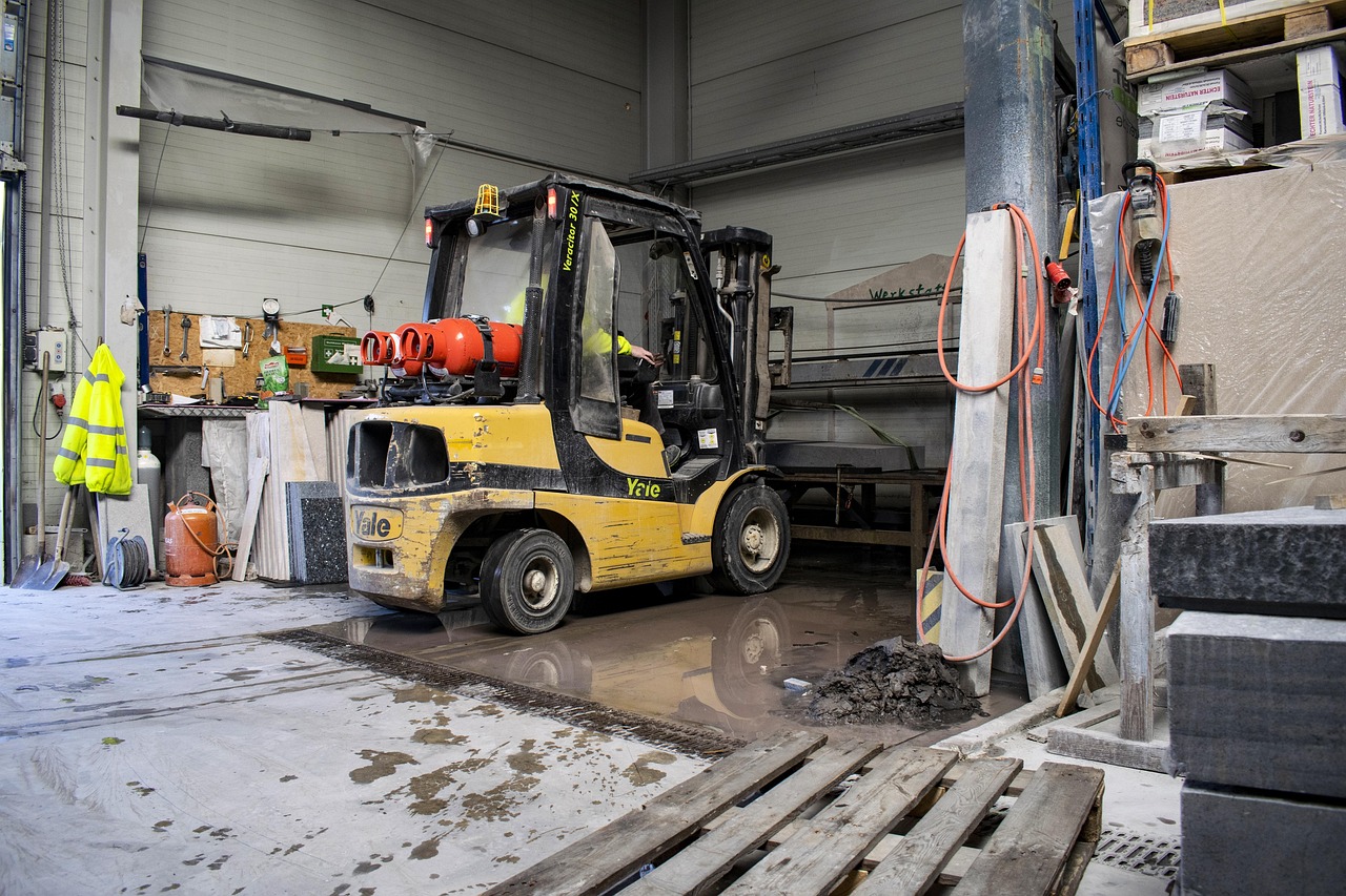
Let's be honest about where and how people in construction are actually accessing websites. It's rarely from a comfortable office chair. More often, it's from a van during a lunch break, standing on site between meetings, sat in a client's waiting room, or whilst walking around a project checking things off.
Your site managers aren't logging onto desktop computers to check your health and safety policies. They're pulling their phones out of their pockets. Your potential clients aren't waiting until they get back to the office to research contractors. They're Googling you the moment they think of it, which is usually whilst they're out and about.
Here's what the data shows: over 70% of construction-related web searches now happen on mobile devices. That number jumps even higher for local searches like "builders near me" or "emergency electrician". When someone searches for construction services, they want information immediately, and they're almost always on their phone when they do it.
But it's not just about searches. Think about all the practical, day-to-day scenarios where your website needs to actually function on mobile. A subcontractor needs to check your insurance details before signing a contract. A client wants to show their partner your portfolio whilst they're discussing the project over dinner. Your apprentice needs to access a training document but they're on site without a laptop. A quantity surveyor needs your company registration number for a tender submission and they're working from multiple sites that day.
Every single one of these scenarios involves someone trying to use your website on a mobile device, probably with patchy signal, possibly with gloves on, definitely without the patience to wait for a slow-loading desktop site to render on a tiny screen.
The consequences of a poor mobile experience aren't abstract. They're immediate and measurable, even if you're not currently measuring them.
When someone lands on your website from their phone and it doesn't work properly, they don't persevere. They don't think "oh well, I'll try again on my computer later". They leave. Immediately. Google's data shows that 53% of mobile users abandon sites that take longer than three seconds to load. Three seconds. That's how long you've got.
But it gets worse. When someone has a bad mobile experience with your website, they don't just leave - they form an opinion about your entire business. If your website looks amateur on mobile, they assume your work is amateur. If your site is slow and clunky, they assume you're slow and outdated. Fair or not, that's the reality of first impressions in 2026.
There's also the Google penalty to consider. Since 2019, Google has used mobile-first indexing, which means it primarily uses the mobile version of your site for ranking and indexing. If your mobile site is rubbish, your search rankings suffer. All those potential clients searching for construction services in your area? They're not even seeing you in the results because Google knows your mobile experience is poor and doesn't want to send people to a site that won't work properly.
Think about the last time you tried to use a website on your phone and it was painfully slow, required constant zooming and scrolling, had buttons too small to press accurately, or kept redirecting you to irrelevant pages. Did you persist? Or did you go to the next result in Google? Your potential clients are doing exactly the same thing when they encounter your mobile unfriendly site.
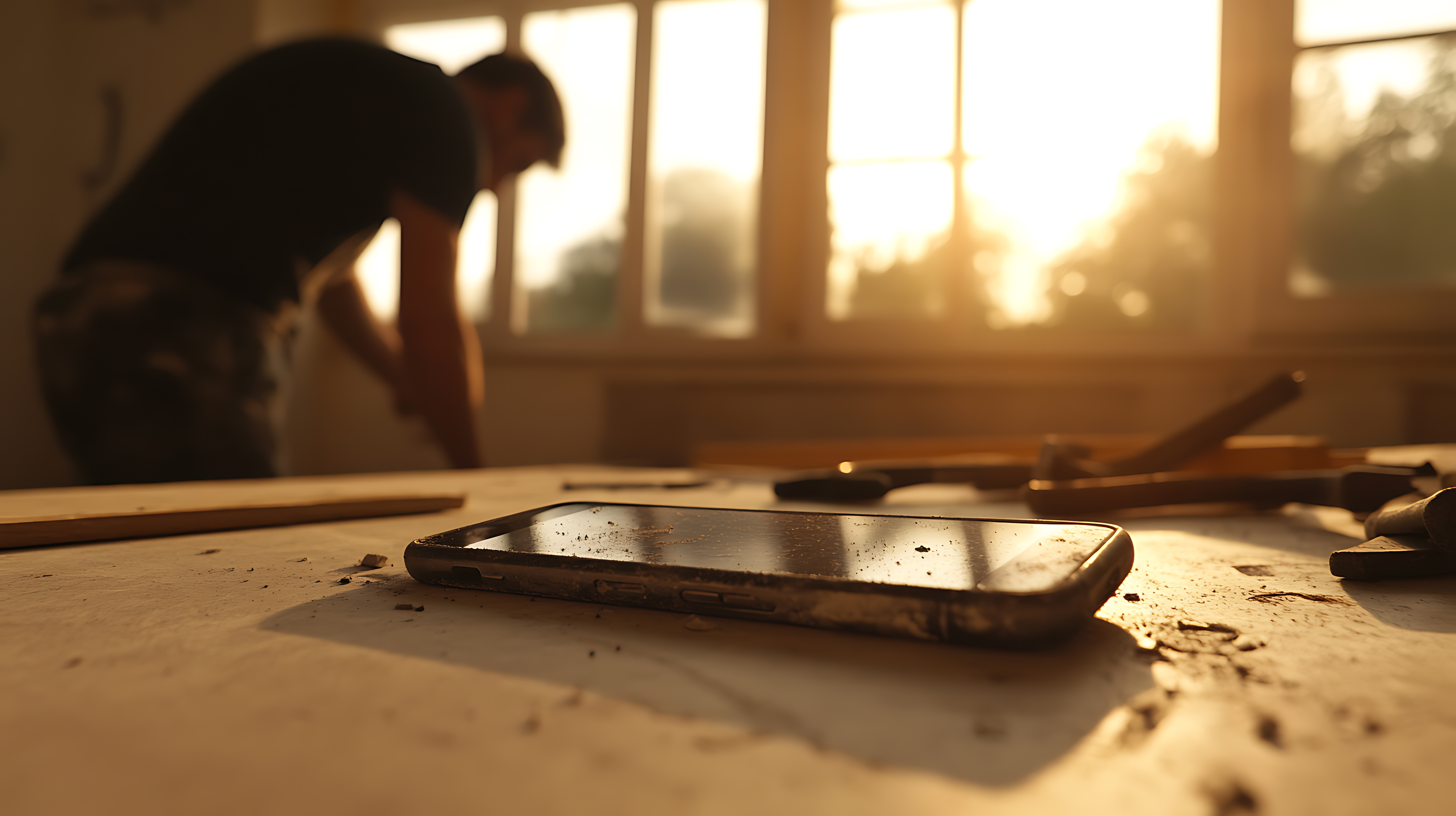
Construction sites aren't known for their excellent WiFi. In fact, they're often connectivity black holes. Basement excavations, steel-framed buildings, rural locations, temporary site offices - these are not environments conducive to streaming HD video or loading image-heavy websites.
Your website needs to work on 4-5G. Better yet, it needs to work on patchy 4-5G with someone stood behind a concrete wall. Because that's the reality of on-site connectivity. If your website is bloated with massive images, excessive scripts, or unnecessary features that require constant server communication, it simply won't function in these conditions.
This isn't about creating a "lite" version of your site. It's about building a site that's efficient enough to work anywhere. Fast-loading pages aren't just nice to have when you're operating in an industry where people need access to information in challenging connectivity environments - they're essential.
Consider the practical implications. Your site supervisor needs to show a client your previous work, but the photo gallery won't load because each image is 5MB. Your quantity surveyor is trying to download a specification document from your resources section, but it times out because the file size is ridiculous and they're relying on mobile data. These aren't edge cases. These are normal, everyday situations in construction.
There's a common misconception that mobile-first just means "make sure the website works on phones". That's not it. Mobile-first is a fundamental design philosophy that starts with the mobile experience and builds up from there, rather than designing for desktop and trying to cram it onto a smaller screen afterwards.
When you design mobile-first, you're forced to prioritise. You can't fit everything on a small screen, so you have to decide what actually matters. This discipline creates better websites even for desktop users, because you're focusing on the essential information and functionality rather than cluttering the page with everything including the kitchen sink.
For construction businesses, mobile-first design means thinking about what your site managers, clients, and subcontractors actually need when they're accessing your site from their phones. They need phone numbers that are immediately tappable to call. They need addresses that open directly in maps. They need clear, large buttons that work with gloves on or cold fingers. They need information presented in a logical, scrollable format rather than complex navigation menus.
It also means optimising for speed ruthlessly. Every second counts when someone's stood on a windy construction site trying to pull up information. Images need to be compressed but still look professional. Code needs to be clean and efficient. Nothing unnecessary should be loading in the background.
Let's talk about what actually happens when you get mobile right for your construction business. The benefits aren't theoretical, they're immediate and measurable.
First, you stop losing leads to basic technical failures. When someone searches for construction services and finds you, they can actually use your site. They can read your information, view your portfolio, and most importantly, contact you all without frustration. That alone will increase your conversion rate significantly.
Second, your search visibility improves. Google rewards fast, mobile-friendly sites with better rankings. When your site works brilliantly on mobile, you appear higher in those crucial "near me" searches that drive so much construction business. More visibility means more opportunities.
Third, you gain a competitive advantage. Most construction company websites are still desktop-focused disasters on mobile. When yours actually works, you immediately stand out. Potential clients notice. They remember. It signals that you're a modern, professional operation that pays attention to details.
Fourth, your own team becomes more efficient. When your site managers can quickly access safety documents on site, when your estimators can pull up project photos whilst on the road, when your admin staff can check information from anywhere, that's real operational efficiency. It's not just about external perception; it's about internal functionality.
There's also the trust factor. A website that works flawlessly on mobile demonstrates competence. It shows you understand how the modern world operates and that you've invested in doing things properly. For clients making significant construction investments, these signals matter.
Essential Features for Construction Mobile Sites
Not all mobile features are created equal, and for construction businesses, certain elements are absolutely critical whilst others are nice-to-have extras. Your phone number should be immediately visible and tappable on every page. No searching, no copying and pasting, no faff. Someone needs a quote urgently? One tap and they're calling you. This seems obvious, yet countless construction websites bury their contact numbers or display them as images that can't be clicked. That's a conversion killer.
Map Integration
Your address should open directly in mapping apps. If someone's trying to find your office or a project site you've listed in your portfolio, they need to get there with one tap. Integration with Google Maps or Apple Maps isn't optional - it's expected.
Simple, Thumb-Friendly Navigation
Complex dropdown menus don't work on mobile, especially not on construction sites where people might be wearing gloves or have cold hands. Your navigation needs to be simple, with big, easy-to-tap buttons. Hamburger menus are fine if they're well-implemented, but the options inside need to be clear and accessible.
Fast-Loading Image Galleries
Your portfolio is crucial for winning work, but it needs to load quickly on mobile. Use properly compressed images that look professional without being massive files. Lazy loading is your friend here, images load as users scroll rather than all at once. A beautiful gallery is useless if it takes 30 seconds to load on 3G.
Mobile-Optimised Forms
If you're using contact forms or quote request forms, they need to work brilliantly on mobile. Large input fields, clear labels, appropriate keyboard types for different fields (number pad for phone numbers, email keyboard for email addresses), and minimal required fields. Every extra field you add reduces completion rates.
Readable Text Without Zooming
Text should be large enough to read comfortably without zooming. Minimum 16px for body text, larger for headings. Line spacing should be generous. Contrast should be high enough to read in bright sunlight (because that's where construction happens). If someone has to pinch and zoom to read your content, they won't bother.
Offline Capability (Advanced)
For really forward-thinking construction sites, progressive web app (PWA) technology can allow certain pages or documents to be accessible even without connectivity. Imagine your site managers being able to access safety documents in a basement with no signal. That's the kind of functionality that genuinely improves operational efficiency.
Let's drill down into website speed specifically, because this is where most construction websites fall apart on mobile. Speed isn't a nice to have feature. It's the foundation of a functional mobile experience.
The average construction website takes 7-10 seconds to load on mobile. That's catastrophically slow. By the time your site loads, your potential client has already visited two of your competitors and possibly contacted one of them. You've lost before you even had a chance.
Why are construction websites so slow? Usually it's a combination of massive, uncompressed images (photos straight from expensive cameras that are 5MB each), bloated page builders with excessive CSS and JavaScript, too many tracking scripts and plugins, unoptimised hosting that's cheap but rubbish, and no caching strategy whatsoever.
Fixing these issues isn't rocket science, but it does require intentionality. Images need to be compressed, a properly optimised photo can be 200KB instead of 5MB and still look excellent on screen. Code needs to be clean and minimal. Hosting needs to be decent (you don't need the most expensive option, but the £3 a month package won't cut it). Caching needs to be implemented so that repeat visitors don't have to load everything from scratch every time.
The goal is a mobile site that loads in under three seconds on 3G. Achieve that, and you're already ahead of 90% of your competition. People will actually be able to use your site from construction sites, from their vans, from anywhere. That's when mobile-first starts delivering real business results.
Having audited dozens of construction websites, certain mistakes appear repeatedly. Avoiding these will put you miles ahead.
Mistake One: Tiny, Unclickable Buttons
Buttons and links need to be at least 44x44 pixels - that's Apple's recommended minimum touch target size, and it exists for good reason. Anything smaller is frustrating to tap accurately, especially for anyone with larger fingers or wearing gloves. If your call-to-action buttons are small and close together, people will accidentally tap the wrong thing, get frustrated, and leave.
Mistake Two: Horizontal Scrolling
If content is too wide for the screen and requires horizontal scrolling, your mobile site is broken. Full stop. Everything should fit within the viewport width. Tables are a common culprit here - they need to be redesigned for mobile, not just shrunk down.
Mistake Three: Popup Overload
Cookie notices, newsletter signups, special offers, chat widgets - all appearing simultaneously on a small screen creates an immediate desire to leave. Mobile popups need to be minimal, easily dismissible, and never, ever cover the entire screen with no clear way to close them. Google actually penalises sites with intrusive mobile popups.
Mistake Four: Auto-Playing Videos
Nothing burns through mobile data and battery life faster than auto-playing videos, especially on construction sites where connectivity is precious. If you're using video, make it user-initiated. Let people choose to watch it rather than forcing it on them.
Mistake Five: Too Much Information
Desktop sites can get away with more content on a page because screen real estate isn't at a premium. On mobile, walls of text are overwhelming. Information needs to be chunked, scannable, and prioritised. If something isn't essential, consider whether it needs to be on the mobile version at all.
Mistake Six: PDF Documents That Don't Work
Many construction sites link to PDFs for brochures, specifications, or documentation. On mobile, PDFs are often problematic - they're large, slow to load, difficult to navigate on small screens, and sometimes don't render properly. If you must use PDFs, they need to be optimised for mobile viewing, or better yet, present the information as web pages instead.
Here's a simple test you can do right now: take out your phone, turn off WiFi, and try to use your website on mobile data. Actually do this. Don't just look at it, actually try to complete common tasks.
Try to find your phone number and call it. Try to view three projects in your portfolio. Try to find your address and open it in maps. Try to fill out your contact form. Try to find your health and safety policies. Try to download a document if you have them available.
Time how long each task takes. Note any frustrations. Can you read everything without zooming? Do buttons work first time? Does anything feel slow or clunky? If you find yourself getting frustrated with your own website, imagine how your potential clients feel.
Better yet, give your phone to someone who's never used your website before and watch them try to complete these tasks. Don't help them. Don't explain anything. Just watch and take notes. Their confusion is your website's fault, not theirs.
You can also use Google's Mobile-Friendly Test tool, which will analyse your site and identify specific issues. PageSpeed Insights will show you exactly how fast (or slow) your mobile site loads and what's causing the problems. These are free tools that provide actionable insights.
Let's talk money, because ultimately that's what matters. What's the actual return on investment for getting your mobile experience right?
Consider that if 70% of your website traffic is mobile and your current mobile site is losing 50% of visitors due to poor performance (a conservative estimate for a bad mobile site), you're losing 35% of all potential leads before they even see your content. If your website generates 100 enquiries per year, that's 35 lost opportunities. If your average project value is £50,000, that's £1.75 million in potential work you're not even getting a chance to quote for.
Even if you only win 10% of quotes, that's still £175,000 in lost revenue annually, just from having a mobile site that doesn't work properly. The cost of fixing it? A few thousand pounds for a professional mobile-first rebuild. The payback period is immediate.
But the benefits extend beyond direct lead generation. A fast, functional mobile site improves your search rankings, which brings more organic traffic. It enhances your professional reputation, which improves conversion rates. It makes your team more efficient, which saves operational costs. The compounding effects are significant.
There's also the competitive moat aspect. Once you have a genuinely good mobile experience, you're not just ahead of competitors who have poor mobile sites - you're ahead of everyone who'll eventually fix their mobile sites but won't do it as well as you have. First-mover advantage matters in local construction markets where reputation and visibility are everything.
Mobile-first isn't a trend that's going to reverse. If anything, the importance of mobile will only increase as technology evolves and construction becomes more digitised.
We're already seeing voice search becoming more prevalent. People are asking their phones "find me a builder near me" whilst driving or walking around. If your site isn't optimised for voice search queries (which are typically longer and more conversational than typed searches), you're missing these opportunities.
Progressive web apps are becoming more capable, allowing websites to function more like native apps with offline capability, push notifications, and home screen installation. For construction businesses, this technology could allow site managers to access critical documents even without connectivity.
Augmented reality is starting to appear in construction, with clients being able to visualise projects through their phones. Whilst this is still relatively niche, forward-thinking contractors are beginning to experiment with AR for client presentations and design consultations, all delivered through mobile devices.
The point is this: mobile isn't just the present, it's the future. Getting your mobile experience right now isn't just about catching up to where you should be - it's about positioning yourself for where the industry is heading.
If you've read this far and realised your construction website isn't fit for purpose on mobile, what's the next step?
First, audit your current situation properly. Use the mobile testing approach outlined earlier. Get concrete data on your mobile traffic and bounce rates. Understand exactly how bad the problem is, because you can't fix what you haven't measured.
Second, prioritise ruthlessly. You don't need to fix everything at once. Start with the fundamentals: speed, readability, and core functionality. Make sure your phone number is clickable, your images load quickly, and your navigation works. These basics will deliver immediate improvements.
Third, work with people who understand both construction and web design. Generic web designers often don't grasp the specific requirements of construction businesses - the need for robust portfolios, the importance of credential display, the reality of on-site connectivity. You need someone who gets the industry.
Fourth, think long-term. A mobile-first website isn't a one-time fix, it's an ongoing commitment. Technology evolves, user expectations change, your business grows. Your website needs to grow with it. Build something that's maintainable and adaptable, not just functional today.
Finally, measure the results. Track your mobile traffic, your conversion rates, your bounce rates, your search rankings. See what improves after you've fixed your mobile experience. The data will justify the investment and guide future improvements.
The construction industry operates on site, in the field, on the move. Your website needs to work in these conditions, not just in comfortable office environments. When your site manager is standing in the rain at 7am trying to access information, your website needs to deliver. When a potential client is researching contractors whilst sat in their car, your website needs to impress. When a subcontractor needs to verify your credentials on patchy 3G, your website needs to function.
Mobile-first isn't about following trends or ticking boxes. It's about acknowledging how your industry actually works and building digital infrastructure that supports it. It's about respecting your clients' and team members' time by giving them fast, functional access to information wherever they are.
Most importantly, it's about not losing opportunities to basic technical failures. Every lead that bounces because your mobile site is slow, every potential client who can't find your phone number, every impression lost to competitors with better mobile experiences - these are preventable losses that directly impact your bottom line.
The good news? Most construction companies still have terrible mobile experiences, which means getting yours right provides an immediate competitive advantage. The question isn't whether you can afford to invest in proper mobile optimisation. It's whether you can afford to keep losing opportunities because you haven't.


